Here is the criteria that we are marked against for a level four product:

Research/training that we used to hep us create our product:
We used a short tutorial video to help us get to grips with the basics of Quark Express:
This is all the training that we did because I thought that it was enough for me to understand how to make a review and it covered all of the things that I wanted to add into the review. So I thought that this tutorial was very thorough and aloud me to then go straight in and make a review after we had done some deconstructions first and planned where everything would go on the review to make the final making process as less time consuming as possible.
Lorem Ipsum
Another thing that we had to look at, and was a big part of making a magazine review, was Lorem Ipsum. This is text that is used to fill the empty spaces until the review is written. It allows for the review to be made with out the actual review being actually written. It helps with the layout of the page then later the actual review will be added and then everything should line up properly.
Here is an image of Lorem Ipsum being used on a review page, so that the page can be layed out while the review is being written:
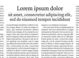
Lorem Ipsum
Another thing that we had to look at, and was a big part of making a magazine review, was Lorem Ipsum. This is text that is used to fill the empty spaces until the review is written. It allows for the review to be made with out the actual review being actually written. It helps with the layout of the page then later the actual review will be added and then everything should line up properly.
Here is an image of Lorem Ipsum being used on a review page, so that the page can be layed out while the review is being written:
We are going to use this to help us layout our review while the text is being written so as both the text and the template will be ready at the same time then all we have to do is add the review in place of the Lorem Ipsum.
Here I have followed the tutorial to create my own mock up magazine review:


Here I have followed the tutorial to create my own mock up magazine review:
For the first screenshot I have put in a border, an image at the top (of the film) and started to put an in cinemas at the top of the review. I used two different coloured boxes to separate the in and cinemas to make it more interesting. I have also added an image for the film that doesn't give much away about the film so that it will force the reader to read the rest of the review. There is also a border that i have put in so that it keeps all of the information together and allows for the redder to easily identify what is part of the review.
In this screen shot I have added the word love, the title, and added the Lorem Ipsum so that I can then adde the pull quote and it will all aline properly when I add the actual review.
Here is the finished review that I have made from the tutorial and this will help me when I come to making the actual review for our film.
Here are some deconstructions of really media products that we also had to do to get ideas of how to create our own products:
Deconstruction 1 "Lust, Caution"

Design and Composition:
The page is set out in portrait and has an image at the top. The image doesn't tell much about the film but does show to characters that look like they are in a relationship possibly but out of the two characters the protagonist is not clearly shown. This will make the reader want to look down further and read until they find out who the two are and out of the two who is the main character.
The main text body is separated into four columns, which is a general convention of film reviews. But the first column is cut short by a pull quote, these are designed to be big and to grab the attention of the reader and so will promote the film and make it out to be 'out of this world'. It is simply there to grab the attention of the reader and so will maybe only be one or two lines long at maximum.
Images:
The only image that is present, and needs to be present as a convention, is the film still at the top of the page that takes up about half of the review page. This review has a girl lying on a man rather intermatly. This suggests that these are the main characters of the short, why would they have people on the main review who are not even part of the film much. Also the way that the characters are placed suggests that the film may be a romance, The characters are looking into each others eyes as well which just further enforces that they are in a relationship of sorts and are rather close. The title then only enforces this further and fully suggests that this is a romantic film that may also end rather badly for one of these characters "Caution" , may suggest that they should have of been careful cause one of them dies or nearly looses there life, but if they would have of been cautious from the start then the whole film could have of been avoided.
Text Elements:
The main text that the viewer will see and be looking for first is the title of the film and the 'in cinemas' text. So they put these both in bold black text that contrasts with the white and orange backgrounds. People generally look for these things because they are looking for films (big bold title) and if it is out yet (in cinemas) so having these as bog as possible is crucial. For this review I think that they have made these two elements definitely the biggest and boldest things on the review and so we may use this in our film to attract the audience efficiently and to follow general review conventions.
Graphical Furniture:
The colours and fonts that have been used for the separators, that separate the verdict and other info, are generalised throughout the rest of the magazine and applies to the magazine not the film that is being reviewed. There is also a summary of the plot, cast ,director, released and certificate at the start of the review and a verdict at the end that says what the film is regardless of what the rest of the review says. Another piece of 'furniture' that is used and is a constant throughout all reviews that are part of the same magazine are a 'look closer' box and this tells the reader some of the behind the scenes parts to the film and how it was made.
 |
| Dorian Gray Deconstruction |
Flat Plan For Magazine Review:

After we had done the necessary research, we began the construction of a flat plan to see roughly how the review would turn out and to see whether it had all the components of a real magazine review.
It follows the conventional pattern of a magazine review:
It follows the conventional pattern of a magazine review:
- A still image that has been cut from the film to show off as little of the film but is enough to give a rough idea of what the film is about.
- The magazine brand which is simply a 'in cinemas' general thing that a magazine will have at the top of each of its reviews and is part of the magazine and has nothing to do with the review itself.
- A review comment that basically just summarises what is happening in the picture and is sometimes comical.
- The movie title which is as simple as it sounds, its the name of the film.
- A tagline which is also generally a comical line and describes the film as a whole.
- A pull quote and this is used to attract the audiences attention by being big and making the film sound really eye catching and a 'must watch'.
- A details and plot summary section that tells the reader the length of the film, the director, cast, when it is going to be released and the certificate of the film (this is not a specific order and can vary but these are the general ones that are used).
- A verdict and star rating section that summarises how the film is in a short paragraph and will complement or insult the film in question regardless of what the rest of the review says.
- Finally a main body of text that is generally in four columns and contains the main body of the review.
Draft magazine review construction:

For the first screen shot we have shown how we used the box tool to create a border to go around the page review. A similar border would be used for each page in the entire review book. We made the border have thick and two thin lines working in from the outside in.

In this screen shot we added a picture which we captured from a part in the film that we will then use to add context to the review at the bottom of the page.

We have now added a backdrop for the title of the film so that it stands out more and looks appealing to the viewer.

I then added the name of the title and gave it the 'impact' font style to give it some more presence on the page because it is bold and big so it stands out form the rest of the review.

In this screen shot I have used Lorem Ipsum to fill in the gaps where the text should be so that I can properly organise the poster so that it looks something like the finished product.

We finished putting in the Lorem Ipsum in place of the text that we would add later. We also moved the small piece of text in the middle over to the side and added a dividing line in at the end of the text to make space for summary at the side including the elapsed time of the film and a summary of the plot.

We have now added the text in that we wanted for the review and have now added in the summary at the side. We have added the length of the film, the cast the director and a brief summary of the plot. We have also added some more dividing lines to neaten the page and text.

We have finished the summary column now by adding a verdict on the bottom and an over all rating.

In this screen shot we have added the 'in cinemas and bullet point onto the the image at the top of the page.

We have added a final page number on the bottom and the name of the website that the magazine review is part of.
This is also the finished magazine review that we have come up with. This is our first draft and it may be changed after it has been checked and deconstruction by our teacher.
Feed back and evaluation of feed back:
Positives of first drafted magazine review:
- The house style that we had applied to the review fitted well. We chose to have the house style as reds, blacks and whites and this seemed to fit we'll wight the rest of the review and the class seemed to like it .
- The page number and URL at the bottom the page was good. These weren't hard to do but we were glad that we didn't have to change or re-do it.
Improvements that need to be added to make the final magazine review:
- Added 4 columns in instead of three to space out the text more evenly and also to follow conventions of other magazine reviews. Also putting in another column helped with moving the Pull Quote because it fitted around the text a lot more effectively. We also rearranged the 'Released' section to be at the start along with the plot summary as well. This was moved because it fitted conventions of other magazine reviews but originally we put it with the rest so that all the main info was together and could be read separately to the rest of the view if the viewer wanted to.

- We changed the text on the plug-in on the image still to fit the rest of the review and also change the colour of it to white so that it stood out and was easier to read. We also got rid of the black background off of it as well because it didn't really work. We also changed the actual content of the plug-in as well due to the image having to be changed as well. The text now has some irony and is slightly comical which general convention of the plug-in's on a magazine review.

- We rearranged the 'in cinemas' image by moving it down the page so that it fitted on the review better. We also changed the colour of the text to white so that it was easier to read and also added an effect over the text to make it more interesting. Will finally also changed the size of the 'arrow' itself so as to make it bigger and easier to read.

- We also changed the actual image itself because it was too blurry and didn't suit being used as a image still. So we changed it to Rebecca lying at the bottom of the stairs. This implemented the thought of "who is this character and why is she dead, how did she die?" So that then makes the reader want to find out who this person is and why she is dead at the bottom of some stairs.

- We inserted a drop capital at the start of the review to follow review conventions. This helps attract the audience to the text and start to read the review.

- We altered the pull quote so that it applied more to the review ad followed the reviews views. We changed it because it made the film the sound like a horror not a thriller so we changed it so as to make it a more general theme of the whole review rather than just talking about the film.

- We also pulled the star rating down so that it had equal spacing between the bottom and the top lines. This was simply done to make everything more equal and aligned neatly.

- We added in a sub-headline underneath the movie title so as to attract the target audience and make the review follow more movie review conventions. We also made it quite comical as well to try and make it apply to general conventions as much as possible.

- We then finally addressed some of the punctuation and grammar errors.
Final Magazine review

Here is the final magazine review. We have made the necessary changes that were needed to be done and this is it finally completed.
We also made a deconstruction of our final film magazine review to show what points we had put in it:

